
 There’s hardly anyone who hasn’t grown up reading comics being totally engrossed in it. Comics transport us to different worlds of superheroes, enchanted places, magic, horror and fantasy. It acts a temporary escapade from the otherwise monotonous humdrums of reality.
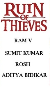
Over the years, comics have seen several changes in terms of content and its treatment. Fantasy tales has remained a fan-favourite throughout and low-fantasy, more so. Low fantasy is a subgenre of fantasy fiction where magical events intrude on a normal world. It thus contrasts with high fantasy stories, which take place in a fictional world with its own set of rules and physical laws. Indian by birth and currently based out of London, comic artist and writer, Ram Venkatesan’s Brigands and its sequel Brigands:Ruin of Thieves, explores the same.
Told through four books and with the last issue of the second season going to be out on 5 September, Ruin of Thieves is a grimdark sword and sorcery story with a heist movie plot as our heroes must survive cross and double cross their own reputations to come out on top.
“Brigands is pretty much low-fantasy stories I’d love to read as a kid. They’re massive comfort read. Joe Abercombie’s First Law books were very influential. Talking about just the fourth book would give away the climax! Suffice to say in Ruin of Thieves our heroes get into a whole lot of trouble and then, through a combination of luck, grit, lots of stabbing and a moment of magic, they get out of trouble but only to find that all the things they’ve assumed so far, might just be wrong. And what seemed like a victory might only be a brief reprieve from the thunderclouds waiting at the horizon,” mentioned Venkatesan.
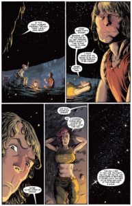
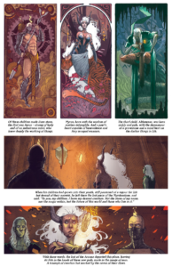
Ruin of Thieves follows the events after the Myros Comet passes, setting the night ablaze, a spark to a tinderbox of political forces vying for its power. As the first flames of conflict begin to rise, the heroes, led by the infamous Stilian ‘Blackheart’ Desault, find themselves on the smuggler’s isle of Rekik and for all their efforts at keeping their heads low, trouble seems not to leave their side.
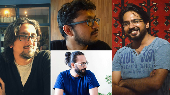
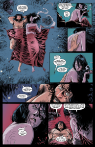
 Brigands, had mostly people from abroad working on the art with colourist Roshan being the only Indian on board. In Ruin of Thieves however, Venkatesan had changed the style of the book by bringing in an all Indian crew with Sumit Kumar on art and Aditya Bidikar on lettering. Roshan continued as the colourist and the story was taken for publishing by Action Labs Danger Zone .
Ruin of Thieves juggles between light-hearted and serious moments. Illustrator Kumar said, “The art style is a mix of serious, dark, heavy, inked art with animated expressions and body language at places to go in sync with the story. It’s basically two styles coming together. Blacksad was an inspiration, though there is a slight difference as Blacksad has dark stories set in an animated world while in Ruin of Thieves, we have a light-hearted, animated story set in a dark, real world. I’m also into video games, so games like Witcher and Skyrim were also a huge source of inspiration.
In Ruin of Thieves artworks are mostly traditionally hand drawn in ink. Few pages and panels towards the end that were done digitally in total. 95 per cent of it is traditional, according to Kumar.
“About my preferred medium, It’s Tra-digital. Both traditional and digital as they have their own strengths and weaknesses and I use them accordingly. I started out from drawing on paper. so it’s the medium I’m most comfortable with. Plus, I really like the textures and finish I can get with inks. Drawings comes out best when handled traditionally. Traditional original art have more value as well and can be sold to collectors later.I use computers for wherever adjustments are needed. Generally, I start out a drawing traditionally, refine it in the page layout I’ve prepared digitally and then print it out in blue to ink traditionally.”
 He further added that in drawing there’s one technique when it comes to storytelling – making decisions that trigger subconscious responses. How a character is drawn, how are they dressed, the composition, angles and many more all fall within the domain of those decisions.
“When it comes to drawing, I’ve literally used every ink technique I know. From conventional techniques like Hatching, ink-washes, spatters and dry brush to methods like smudging, fingerprinting, razor blade etching and Digital halftones . I’ve used whatever interesting things I can get my hands on (ear buds, tissues, rags, crayons) to create marks. You should watch out for Rosh’s colours on those pages. They are my favourite from the series.”
Similarly, colourist Roshan also threw some light on how his techniques influenced the plotline of the book and vice versa. “Even though I love the way water coloured comic books look, I decided to go completely digital with this book. Since Sumit’s inks were so detailed and he had given a bit of texturing in the inking style itself, I thought a colouring style that’s focused much on lighting and some dramatic shadows to perfectly retain the rawness of his inks. I decided to go with a simple technique which involved no photoshop tricks but just filling in every color with a custom made Photoshop brush.
Gouache and acrylic paints are some mediums I love working with. Digital colouring makes the process very quick so I mostly stick to that when the deadlines are tight but sometimes I use my own custom made photoshop brushes that gives the feel and texture of a watercolor painting,” he added.
Letterer Bidikar too elucidated on his process of lettering that created the impact that the book wanted. Unlike most letterers, Bidikar creates his original font design. “To create a new font design, I usually sketch out a few pages of lettering on paper to try out different styles to see how they work with each other. I usually start with one or two letters and then the rest, trying to fit with those. It takes a lot of trial and error and once I’m happy with the style, I scan the pages and trace the letters out digitally into vector letterforms (usually in Adobe Illustrator),” he noted.
Following this process, he polishes the versions that will go into the font besides creating italics and bold versions based on these. Once the letters are finalised, he transfers them into a font creation software (Glyphs in his case) and then work on the spacing between letters and so on. He also creates most of his sound effects by drawing them in Photoshop and then importing them into Illustrator which gives him a lot more control over the design and storytelling than using fonts to create the sounds.
Such an ambitious project is sure to have its portion of challenges. Venkatesan shared, “I suppose the only challenge was fitting the story in four issues. We had them oversized, but the arc was intended to run five issues long. I think it’s better this way, to be honest. But it took a little bit of creative jugglery to get it all in there.”
Despite the challenge, a project that sounds as exciting as this, has no dearth of enriching experiences for the ones associated with it. The Ruin of Thieves team was no exception.
“It was a good experience. Ruin of Thieves have been the kind of story that come to you fully formed. So, it’s only been a matter of putting everything down on paper and allowing for those occasional moments of spontaneity. I work with an excellent creative team so they all make me look very good,” said Venkatesan.
 Kumar reciprocated the same sentiment and said, “It was an absolute pleasure to work with the team. It was a great learning experience as well. All teammates were so experienced in their respective field and it was wonderful to see how they handle their part of work. Since I’m interested in learning all aspects of creating a Comic Book, it was fascinating to see it taking shape in their skilled and experienced hands. I’m quite happy with how the book has turned out.”
Colourist Roshan added on the similar line with Kumar, “I had been working with Ram for almost three years now on different projects. He is a brilliant guy who is already on a well planned journey to the top of comic book universe. The best thing about Ram is he lifts up his entire team with every step he takes towards that target. So, I did not doubt his choice of artist one bit. Ruin of Thieves has been an important milestone in my journey as a comic book colourist. Sumit single-handedly has lifted the quality of art up and looking at his art inspired my colouring a great deal. Some panels were so good that I could see colours in his inks itself.”
Bidikar too shared the same feeling as his team mates, “I’ve worked with everyone on this team before, and we have a comfortable dynamic, so I knew going in that it would be a fun project. But even apart from that, Ruin of Thieves has been one of my favourite books to work on because the snappy dialogue and the expressive art gave me a lot of scope for expressive lettering as well. Plus it was the debut book for one of my fonts, so it holds a special place in my heart.”
Slated to be launched day after tomorrow, Brigands:Ruin of Thieves promises to take one on a thrilling ride with all its add on interesting elements. The single issue will be available in print from 5 September and the team is also working on to make sure that the collected edition is available soon! The digital versions, however are available everywhere.
We’re quite sure that we won’t be disappointed!